Sage Griffin
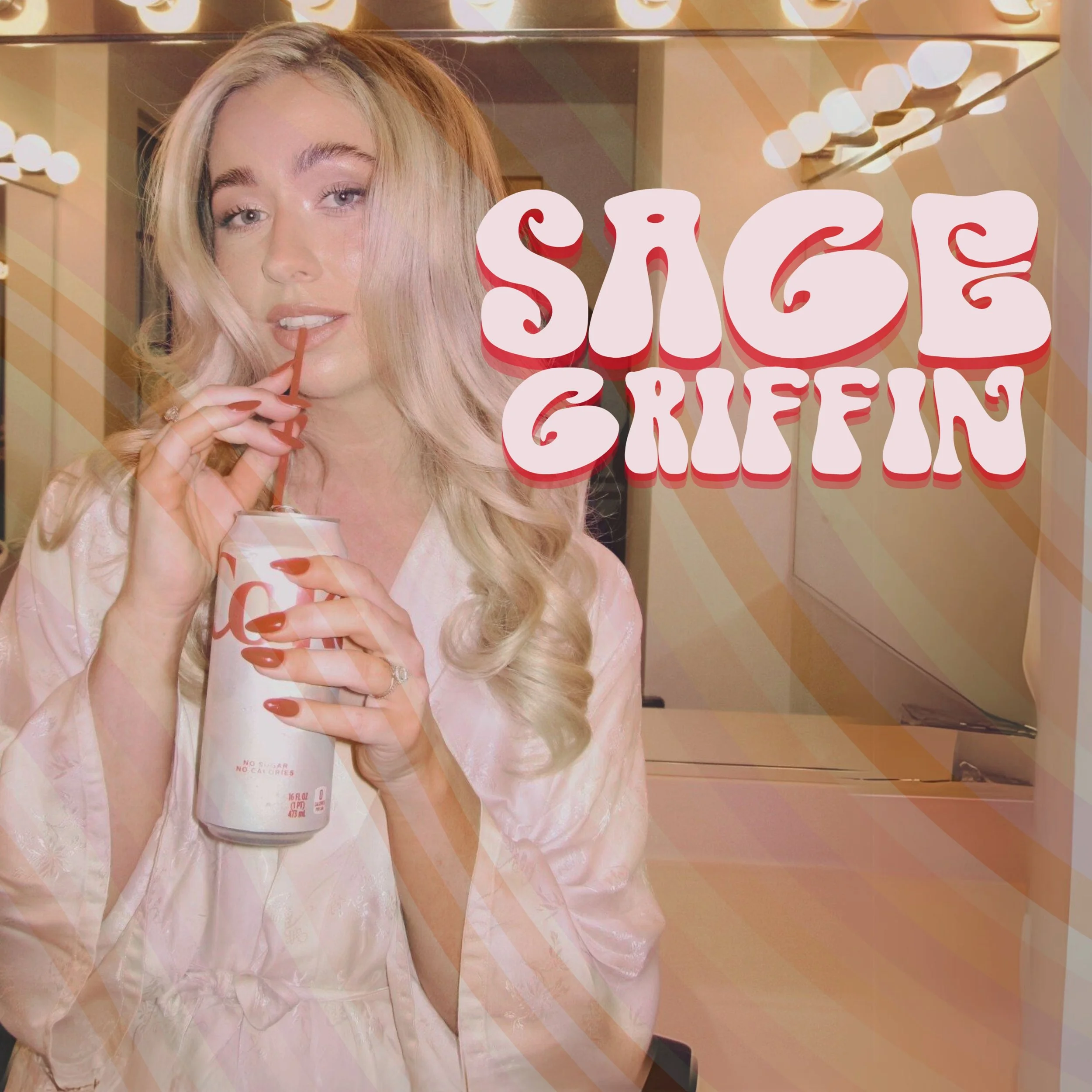
Sage is an empowering and stylized production designer who doesn't shy away from color and bubbly design.
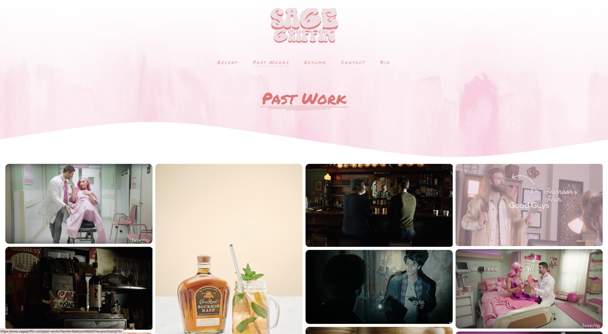
When we connected with Sage, we were thrilled to know she wanted us to redesign her site! We asked her for inspiration or a lookbook of the style she wanted, knowing that her design style has always been crisp, vivid, and fun. When Sage mentioned she wanted something groovy and retro and sent us images of branding for clean but bright makeup brands, we thought of the '70s, mid-century Palm Springs, and Southern California's fluid and colorful textures.
BUSINESS : PRODUCTION DESIGN
DESIGN STYLE : ABSTRACT PALM SPRINGS
TALKING DESIGN
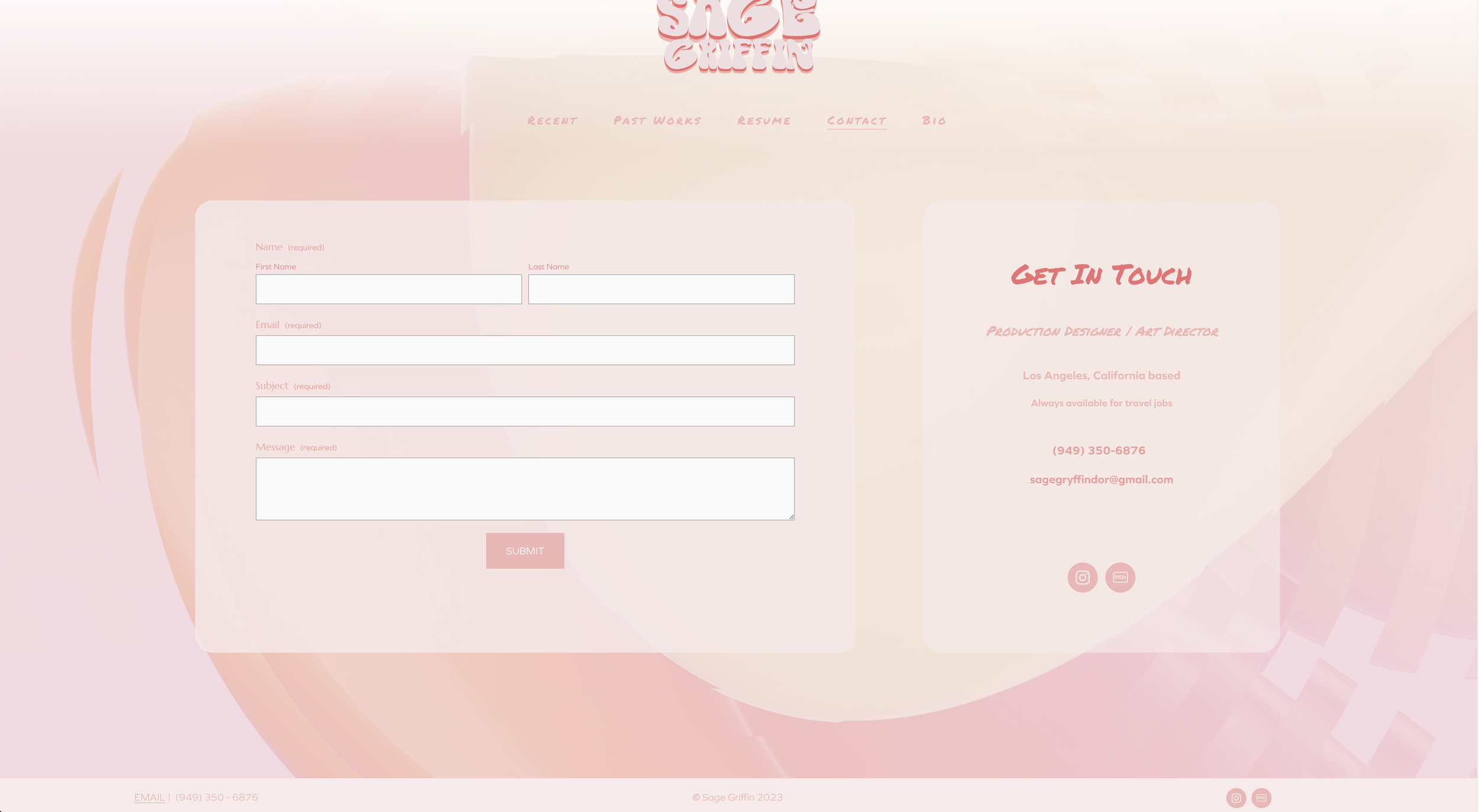
We looked over stills of her designs and became committed to our idea of flowing textures, motions, and vivid coloring. We knew that bright colors would distract from her portfolio, so we smoothed over the tones with a soft overlay, blurred backgrounds, and added interactive motions. Any bright colors became accents and were used for headings or font—drawing attention to important text but not distracting visitors from her hard work.
Sage’s site is still one of our favorites. It was the first time we used pink in an empowering and exciting way, and it was also one of the first sites where we could have a blast with motion and cool background imagery.
CLIENT TYPE : WEB DESIGN
PLATFORM : SQUARESPACE


